Building a QGIS Plugin with Python, Qt, and PyKrige
Developing a custom QGIS plugin is the best way to bridge the gap between raw data and professional analysis. In this post, I explore the creation of HydroKrig, a QGIS plugin designed to perform spatial interpolation using the PyKrige library directly within a PyQt interface.
The Developer's Toolkit: Prerequisites
Before diving into the code, we needs a solid environment. To build HydroKrig, I relied on two essential plugins that streamline the workflow:
- Plugin Builder 3: It generates the base structure of the plugin (folders, resources, and boilerplate code) so you can focus on the logic.
- Plugin Reloader: It allows you to apply changes to your Python code and see the results instantly in QGIS with a single click, without having to restart the entire software.
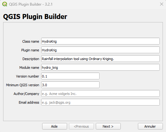 QGIS Plugin Builder interface
The Interface: Designing with Qt Designer
The first step was building a functional UI. Using Qt Designer, I created a dialog box that allows users to interact with their GIS data.
The heart of the UI is the comboBoxDate. Unlike standard GIS tools, the plugin scans the attribute table of the selected layer to find all unique dates.
- Dynamic Loading: Every time the user selects a different layer, the Python script updates the date list automatically.
- Signal/Slot Mechanism: I used the
layerChangedsignal to trigger a refresh of the available fields and dates, ensuring the UI stays in sync with the map.
The Toolbar Icons
Once installed and configured, the QGIS toolbar gains two critical new tools for this project:
- The HydroKrig Icon: This is our custom plugin button (usually a custom SVG icon defined in the resources). Clicking this opens the main dialog window where the interpolation parameters are set.
- The Plugin Reloader Icon (Yellow Arrow): This is your best friend during development. Every time you modify the Python logic or the UI file, you simply click this icon to "hot-reload" the plugin without losing your QGIS session.
- The Plugin Pop-up: When you click the HydroKrig icon, the main plugin window appears.
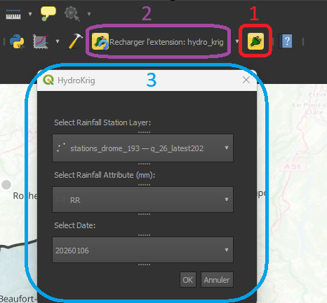 The new icons (1 & 2) and the plugin pop-up (3)
The Engine: Spatial Interpolation with PyKrige
This plugin is powered by PyKrige, a specialized Python library for geostatistics. While QGIS has built-in interpolation tools, PyKrige allows for much finer control over the mathematical model.
1. Preparing the Data
Before running the math, we must convert QGIS "Features" into a format PyKrige understands: Numpy Arrays. The script loops through the map points, filters by the selected date, and stores the coordinates ($x, y$) and the values ($z$) into arrays.
# Convert filtered lists to numpy arrays for PyKrige
import numpy as np

data_x = np.array(x)
data_y = np.array(y)
data_z = np.array(z)
2. Executing Ordinary Kriging
We implemented Ordinary Kriging, which assumes a constant but unknown mean across the basin. Using a linear variogram model, the plugin calculates the predicted rainfall for every cell in a 100×100 grid.
from pykrige.ok import OrdinaryKriging

# Initialize the Kriging engine
# We use a linear model to represent the spatial trend of the rainfall
OK = OrdinaryKriging(
    data_x,
    data_y,
    data_z,
    variogram_model='linear',
    verbose=False
)

# Execute the interpolation on the defined grid
z_interp, sigma = OK.execute('grid', grid_x, grid_y)
3. Geoprocessing: Masking the Results
To achieve a clean result, the raw Kriging output (which is rectangular by default) needed to be constrained. In QGIS, I applied a mask layer using the boundaries of the Drôme watershed.
By clipping the interpolation result to the specific shape of the basin, we eliminate irrelevant data outside the study area, focusing the viewer's attention on the hydrological dynamics of the Drôme river.
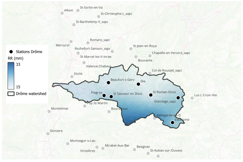 Rainfall on April 13, 2025
Final Thoughts
Building HydroKrig was a great learning experience in combining different Python ecosystems within QGIS. While the plugin is currently a specialized tool for the Drôme watershed, it serves as a personal proof of concept for automating geostatistical workflows.
There is certainly room for improvement—such as optimizing speed or adding more variogram models—but it demonstrates how accessible plugin development can be with the right tools.
Get the Code
The source code for this project is available on my GitHub. Feel free to check it out, use it as a reference for your own plugins, or suggest improvements! 👉Link to my GitHub Repository
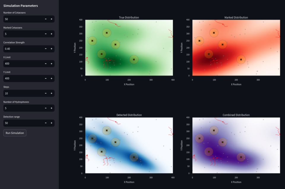
 Combining (in purple) passive acoustic detection (data from hydrophones in blue) and marked individuals data (in red) may decrease the global error.
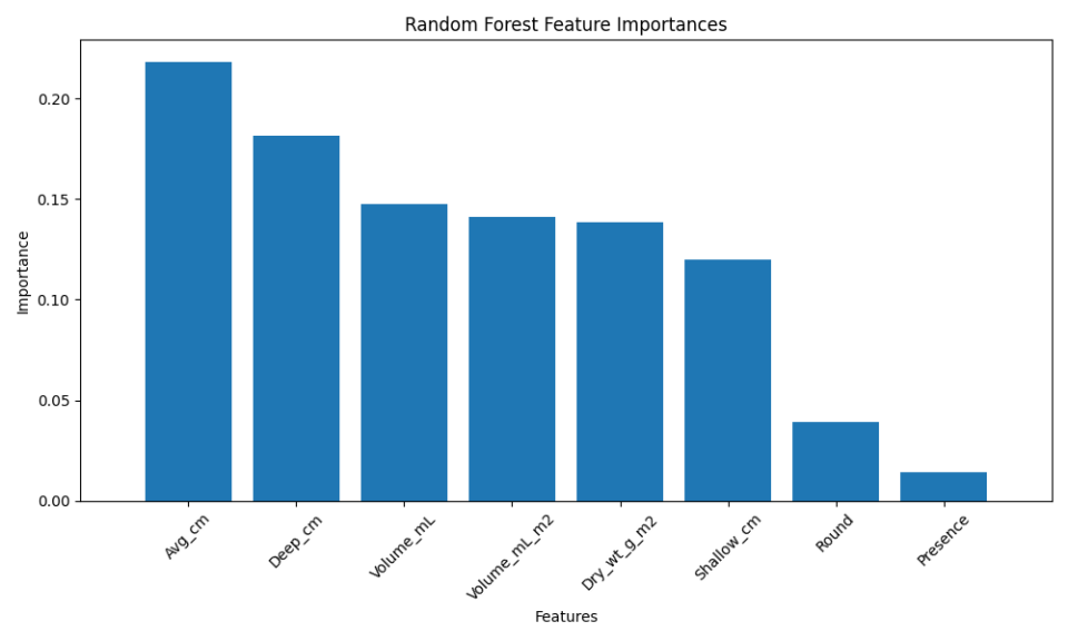
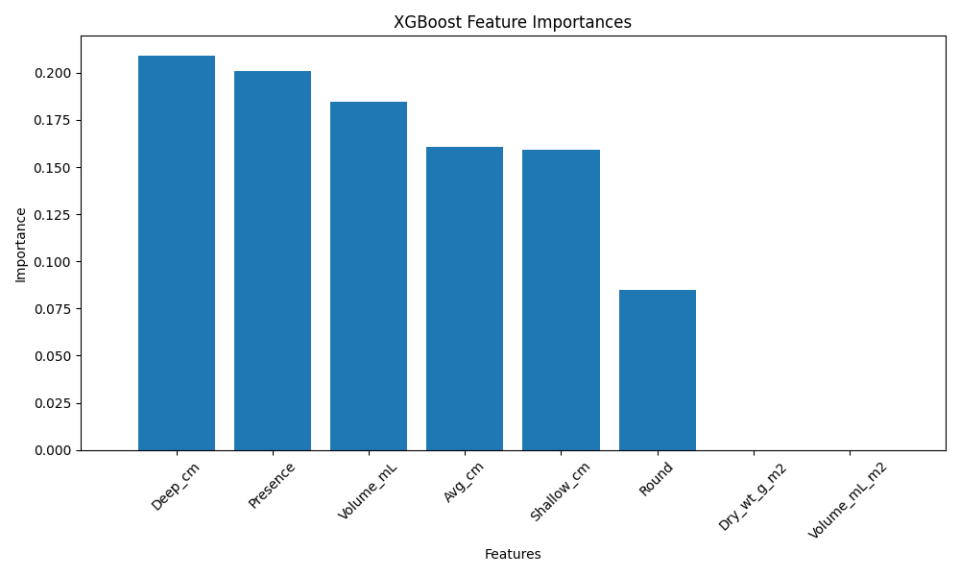
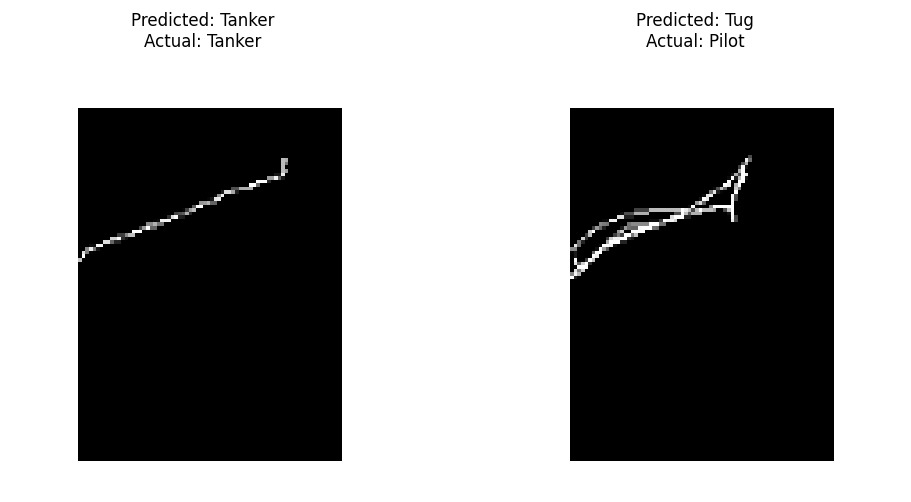
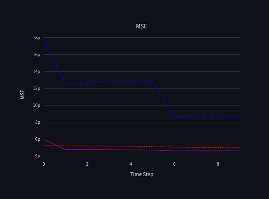
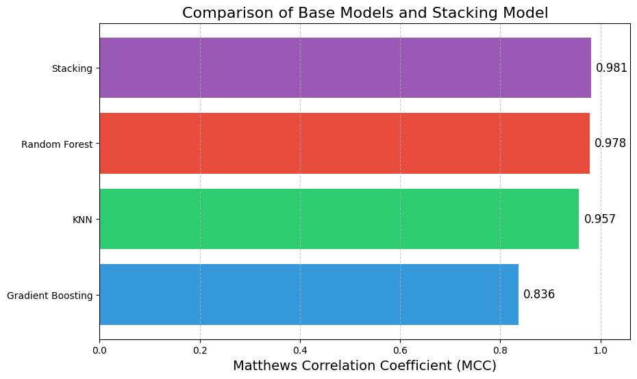 Here, the stacking model slightly outperformed the individual base models. While the improvement may seem marginal, in high-stakes scenarios, even small gains in performance can be critical.
  Credit: Yakfish Taco
 Credit: Janusz Szwabiński