Marine Macrofauna Detection: A Toy Model for Hydrophone and Marked Individuals Detection
In this project, I have developed a simple toy model that simulates cetacean (or macrofauna) movement patterns and combines two detection methods: hydrophones and marked individuals. The goal is to explore how these two detection techniques can work together to improve the monitoring and conservation of marine species.
Project Overview
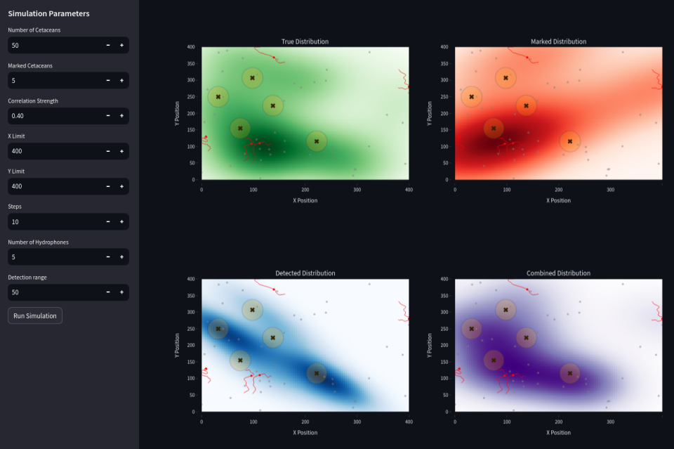
The model simulates a population of cetaceans moving within a defined area, with hydrophones placed strategically to detect the cetaceans. Additionally, a subset of cetaceans are marked, and their movements are tracked separately. By combining both methods, I aim to assess how well each detection technique performs and how they can complement each other.
The simulation generates interactive visualizations where you can explore the cetacean movement and detection data. The results include real-time plots of cetacean trajectories, density heatmaps, and the Mean Squared Error (MSE) between the actual and detected positions.
Features
- Cetacean Movement Simulation: Cetaceans are simulated to move, with their movements affected by a correlation parameter.
- Hydrophone Detection: Hydrophones are randomly placed allowing for the detection of cetaceans, with accuracy determined by their proximity to the hydrophones.
- Marked Individuals: A subset of cetaceans is marked, and their movements are tracked separately to assess the detection accuracy for marked individuals.
- Error Analysis: The Mean Squared Error (MSE) metric is used to compare the detected positions against the actual positions, allowing for performance evaluation.
- Interactive Dashboard: A Streamlit web app enables interactive exploration of the simulation, where users can adjust parameters and visualize results.
You can explore the live web app here and the code is available here.
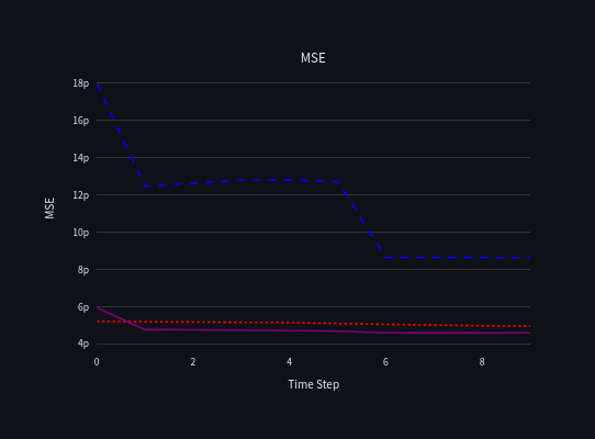 Combining (in purple) passive acoustic detection (data from hydrophones in blue) and marked individuals data (in red) may decrease the global error.
Visualization
The web app presents a visualization of the simulation results. It includes:
- Density Heatmaps for both the marked cetaceans and those detected by hydrophones.
- Trajectories showing the movement paths of cetaceans over time.
- Error Metrics that visually show how accurate the detection methods are by comparing the simulated positions to the detected positions.
In the Streamlit interface, the user is presented with a set of input parameters to configure the simulation. Here's a breakdown of each parameter:
Number of Cetaceans (
N):- This parameter sets the total number of cetaceans in the simulation. It is a basic parameter that defines how many animals will be simulated in the study area.
Marked Cetaceans (
M):- This specifies how many of the total cetaceans are marked for tracking purposes. Marked cetaceans are used to represent the subset of the population that will be detected using hydrophones or other tracking methods.
Correlation Strength (
correlation_strength):- This parameter defines the strength of the movement correlation between the cetaceans. A value closer to
1indicates a high correlation, while a value closer to0means no correlation.
- This parameter defines the strength of the movement correlation between the cetaceans. A value closer to
X Limit (
xlim):- Defines the extent of the simulation area in the X direction (horizontal). It sets the maximum possible value for the X coordinate of any cetacean.
Y Limit (
ylim):- Defines the extent of the simulation area in the Y direction (vertical). It sets the maximum possible value for the Y coordinate of any cetacean.
Steps (
steps):- This parameter sets the number of time steps for the simulation. Each step represents a discrete time interval during which cetaceans move and may be detected.
Number of Hydrophones (
num_hydrophones):- This sets the number of hydrophones used in the simulation to detect cetaceans.
Detection Range (
detection_range):- Defines the maximum detection range of the hydrophones. Cetaceans within this distance of any hydrophone will be detected.
Methodology
For the density estimation, I use Kernel Density Estimation (KDE) (https://en.wikipedia.org/wiki/Kernel_density_estimation), which is a non-parametric way to estimate the probability density function of a random variable. This method works well in this case to visualize the concentration of cetaceans across the space. However, other techniques, such as Kriging or spatial interpolation methods, could also be applied for density estimation, depending on the specific needs of the simulation and the available data.
Conclusion
This project is a simple exploration of cetacean detection techniques, using a toy model to combine two commonly used methods: hydrophones and marked individuals. While the model is relatively basic, it provides valuable insights into the detection process and highlights potential challenges in real-world cetacean monitoring and conservation efforts, specially when data sources are multiple.
Feel free to explore the web app, interact with the parameters, and see how the simulation performs under different conditions. This model could be expanded to include other detection methods, species, or environmental factors.
Check out the live simulation here!