Archive of

Combining Models for Better Predictions: Stacking in Machine Learning

What is Stacking?

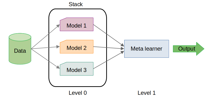
Stacking is an ensemble learning technique that combines the predictions of multiple base models (level 0 models) to generate a final prediction using a meta-model (level 1 model). Unlike simple voting or averaging methods, stacking uses a meta-model to learn how to best combine the predictions of base models, thereby capturing complex patterns and relationships in the data.

How Stacking Works:

  1. Base Models (Level 0 Models): These are the individual models that are trained on the same dataset. They could be of different types, such as a decision tree, a k-nearest neighbors model, or a support vector machine.

  2. Meta-Model (Level 1 Model): The predictions of the base models are used as features to train a meta-model. This model learns the optimal way to combine the base models' predictions to improve accuracy.

  3. Final Prediction: The meta-model produces the final prediction by integrating the predictions of the base models.

Why using Stacking?

  • Improved Performance: By combining multiple models, stacking can often outperform any single model. It leverages the strengths of each base model while mitigating their weaknesses.

  • Flexibility: Stacking allows you to combine different types of models, making it versatile for various datasets and problems.

  • Reduced Overfitting: The meta-model can learn to generalize better by combining the predictions of overfitted base models, leading to a more robust final model.

The main drawback of Stacking is the training time. It’s computationally expensive and time-consuming, especially for large datasets.

Practical Example: Stacking in Action - Predicting Poisonous Mushrooms on Kaggle

For this practical example, we'll walk through how I used stacking to participate in the Kaggle competition Playground Series - Season 4, Episode 8: Binary Prediction of Poisonous Mushrooms. The goal of the competition is to predict whether a mushroom is edible or poisonous based on its physical characteristics.

I'll skip the loading and pre-processing parts that you can find in my jupyter notebook.

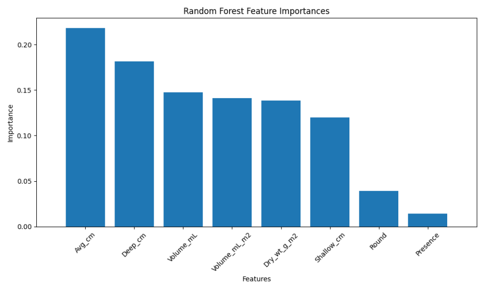
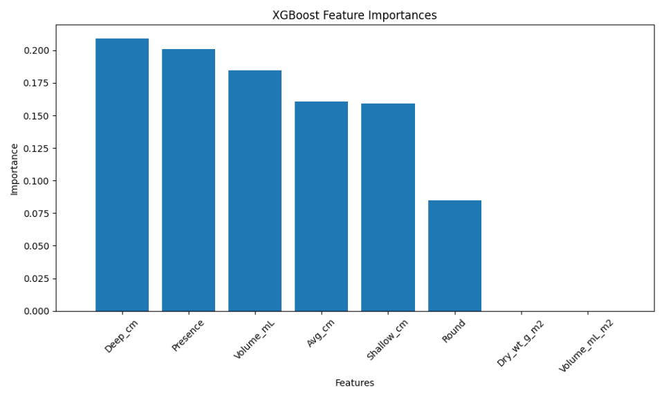
Once the data are correctly formatted, I trained three different models as the base learners:

from sklearn.ensemble import RandomForestClassifier, GradientBoostingClassifier
from sklearn.neighbors import KNeighborsClassifier
from sklearn.linear_model import LogisticRegression

# Initialize classifiers
rf = RandomForestClassifier(n_estimators=100, random_state=42, n_jobs = -1)
gb = GradientBoostingClassifier(n_estimators=100, random_state=42)
knn = KNeighborsClassifier(n_neighbors=5)

# Train classifiers
rf.fit(X_TRAIN, Y_TRAIN)
gb.fit(X_TRAIN, Y_TRAIN)
knn.fit(X_TRAIN, Y_TRAIN)

# Predict on the validation set
y_pred_rf = rf.predict(X_VAL)
y_pred_gb = gb.predict(X_VAL)
y_pred_knn = knn.predict(X_VAL)

To enhance the prediction accuracy, I combined these base models using a stacking approach:

from sklearn.ensemble import StackingClassifier
# Define base learners
base_learners = [
    ('rf', rf),
    ('gb', gb),
    ('knn', knn)
]

# Define meta-learner
meta_learner = LogisticRegression()

# Initialize Stacking Classifier
stacking_clf = StackingClassifier(estimators=base_learners, final_estimator=meta_learner)

# Train Stacking Classifier
stacking_clf.fit(X_TRAIN, y_train)

# Predict on validation set
y_pred_stacking = stacking_clf.predict(X_VAL)

Finally, I evaluated the performance of each base model and the stacked model on the validation set to see the benefits of stacking:

from sklearn.metrics import matthews_corrcoef

# Calculate mcc for each model
mcc = {
    'Random Forest': matthews_corrcoef(Y_VAL, y_pred_rf),
    'Gradient Boosting': matthews_corrcoef(Y_VAL, y_pred_gb),
    'KNN': matthews_corrcoef(Y_VAL, y_pred_knn),
    'Stacking': matthews_corrcoef(Y_VAL, y_pred_stacking)
}


# Sort MCC values for better visualization
sorted_mcc = dict(sorted(mcc.items(), key=lambda item: item[1]))

# Plot the MCCs
plt.figure(figsize=(10, 6))
bars = plt.barh(list(sorted_mcc.keys()), list(sorted_mcc.values()), color=['#3498db', '#2ecc71', '#e74c3c', '#9b59b6'])

# Add MCC values to the bars
for bar in bars:
    plt.text(bar.get_width() + 0.01, bar.get_y() + bar.get_height()/2, 
             f'{bar.get_width():.3f}', va='center', fontsize=12)

plt.xlabel('Matthews Correlation Coefficient (MCC)', fontsize=14)
plt.title('Comparison of Base Models and Stacking Model', fontsize=16)
plt.xlim([0., 1.06])
plt.grid(axis='x', linestyle='--', alpha=0.7)
plt.show()

In this Kaggle competition the performance is evaluated using Matthews Correlation Coefficient (MCC). It is a metric for binary classification that takes into account true and false positives and negatives, providing a balanced measure even when the classes are imbalanced.

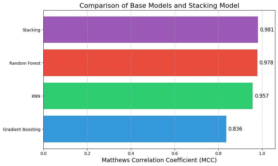
Here, the stacking model slightly outperformed the individual base models. While the improvement may seem marginal, in high-stakes scenarios, even small gains in performance can be critical.


Visualizing Fisheries Data with Sankey Diagrams

Sankey diagrams are an excellent tool for visualizing the flow of quantities between categories. In the context of fisheries data, they help illustrate how different fishing methods contribute to the harvest of various species. This guide will show you how to use a Python script to generate code for Sankey diagrams in different formats.

Overview

The Python script (available on my github) can read a CSV file and generate code snippets for Sankey diagrams in the following formats:

  • SankeyMATIC: A web-based tool for creating Sankey diagrams.
  • Python (using Plotly): An interactive plotting library for Python.
  • R (using networkD3): An R package for interactive network diagrams.

How It Works

1. Prepare Your CSV File

Your CSV file should include these columns:

  • Source: The origin of the flow (e.g., fishing method).
  • Target: The destination of the flow (e.g., species caught).
  • Value: The quantity of the flow (e.g., weight of fish).

Example CSV File:

Engine,Species,Weight
Trawler,Cod,500
Longline,Cod,200
Trawler,Haddock,300
Longline,Haddock,100
...

2. Using the Python Script

The Python script processes your CSV file and generates code snippets for various Sankey diagram formats. You can specify the desired output format using the --output option:

  • sankeymatic: Generates code compatible with the SankeyMATIC web tool.
  • python: Produces code for creating interactive Sankey diagrams in Python using Plotly.
  • r (networkD3): Creates code for generating Sankey diagrams in R using the networkD3 package.
  • all: Outputs code snippets for all the above formats.

Example:

  python sankey_formatter_all.py.py data.csv --output sankeymatic

Python and R output are pretty basic and may be enhanced by playing with the different options.

By copy/pasting the output in SankeyMATIC, it's easier to modify the output Sankey diagram as you need.


Comparing Random Forest and Boosted Trees: An Analysis Using Cockle Field Survey Data

In this post, I'll dive into a comparison of two popular machine learning models: Random Forest and Boosted Trees (XGBoost). I will use a dataset from a study on cockle densities in relation to green macroalgal (GMA) biomass in Yaquina Bay, Oregon. By analyzing their performance on this dataset, we'll explore which model is better suited for this type of ecological data.

Credit: Yakfish Taco

Introduction to Random Forest and Boosted Trees

Random Forest and Boosted Trees (XGBoost) are two ensemble learning methods widely used in machine learning for classification and regression tasks. Random Forest operates by constructing a multitude of decision trees during training and outputs the class that is the majority vote of the individual trees. This approach helps in reducing overfitting and improving model accuracy by averaging the predictions from multiple trees. On the other hand, Boosted Trees, particularly XGBoost, enhance predictive performance through a technique called boosting. XGBoost builds trees sequentially, where each new tree corrects errors made by the previous ones, and it optimizes model performance by focusing on difficult-to-predict instances. Both methods leverage the strength of ensemble learning but differ in their approach to aggregating predictions, making them suitable for various types of data and problem domains.

Credit: Janusz Szwabiński

Dataset Overview

The dataset, originally collected during field surveys in June and August 2014, includes various attributes like site, station, survey date, presence of cockles, and environmental factors such as water depth and algal coverage. The target variable, Present, indicates whether cockles were observed in the sampled area.

Preprocessing and Modeling Steps

Let's go through the steps in the Python script used to preprocess the data and train the models.

  1. Loading and formatting the Dataset:

    file_path = './cockle-fieldsurveydata-xlsx-1.xls'
    df = pd.read_excel(file_path, 'Data')
    df.dropna(inplace=True)
    
    % Date parsing
    df['Date'] = pd.to_datetime(df['Date'], format='%m/%d/%Y') 
    
    for col in ['Easting', 'Shallow_cm', 'Deep_cm', 'Avg_cm']:
     df[col] = df[col].astype(str).str.replace(',', '.').astype(float)
    
    for column in df.select_dtypes(include=['object']).columns:
     df[column] = LabelEncoder().fit_transform(df[column])
       
    % Feature Selection
    X = df.drop(['Uncovered', 'Semi_covered', 'Buried', 'Total','Present','Site','Station','Easting'], axis=1)
    y = df['Present']
     
    % Data splitting
    X_train, X_test, y_train, y_test = train_test_split(X, y, test_size=0.2, random_state=42)
    

The features for the model (X) were selected by excluding irrelevant or redundant columns, while the target variable (y) was set to the Present column (which is a binary indicator equivalent to Total>0). Finally, the data was split into training and testing sets, with 80% of the data used for training and 20% reserved for testing.

Justification for Removing Localization Variables

In the context of this analysis, the localization variables such as Site, Station, and Easting were removed during the feature selection process. These variables represent spatial information about the specific locations where samples were collected.

Including these variables could lead to overfitting, where the model learns to associate specific locations with outcomes rather than general patterns that can be applied to new, unseen data. By removing these localization variables, we ensure that the model focuses on ecological and environmental features that are more likely to provide generalizable insights into cockle presence.

  1. Training the Models:

    % Random Forest
    rf_model = RandomForestClassifier(n_estimators=100, random_state=42)
    rf_model.fit(X_train, y_train)
    rf_predictions = rf_model.predict(X_test)
    
    % Boosted Trees (XGBoost)
    xgb_model = XGBClassifier(use_label_encoder=False, eval_metric='logloss', random_state=42)
    xgb_model.fit(X_train, y_train)
    xgb_predictions = xgb_model.predict(X_test)
    

The Random Forest model was trained with 100 trees, and predictions were made on the test set. The XGBoost model was trained with default settings, and predictions were made similarly.

Performance Comparison and Results

After training both the Random Forest and Boosted Trees (XGBoost) models on the dataset, we evaluated their performance using several metrics, including accuracy, precision, recall, F1-score, confusion matrices, and ROC AUC scores.

Accuracy

  • Random Forest Accuracy: 0.54
  • Boosted Trees (XGBoost) Accuracy: 0.50

Accuracy measures the proportion of correct predictions made by the model. In this case, the Random Forest model slightly outperformed XGBoost, achieving an accuracy of 54% compared to XGBoost’s 50%.

Classification Reports

Random Forest Classification Report:

               precision    recall  f1-score   support

           0       0.55      0.50      0.52        12
           1       0.54      0.58      0.56        12

    accuracy                           0.54        24
   macro avg       0.54      0.54      0.54        24
weighted avg       0.54      0.54      0.54        24

Boosted Trees (XGBoost) Classification Report:

               precision    recall  f1-score   support

           0       0.50      0.42      0.45        12
           1       0.50      0.58      0.54        12

    accuracy                           0.50        24
   macro avg       0.50      0.50      0.50        24
weighted avg       0.50      0.50      0.50        24

From the classification reports, we see that the Random Forest model has a slightly better balance between precision and recall, especially for class 1 (Presence). The F1-scores, which balance precision and recall, show that Random Forest provides a better overall performance with an F1-score of 0.56 for class 1 compared to 0.54 for XGBoost.

Confusion Matrices

Random Forest Confusion Matrix:

   [[6 6]
    [5 7]]

Boosted Trees (XGBoost) Confusion Matrix:

   [[5 7]
    [5 7]]

The confusion matrices reveal how well each model distinguishes between the two classes (0 and 1, or Absence and Presence of cockles). Both models show a similar pattern, with Random Forest slightly better at correctly predicting class 1.

ROC AUC Scores

  • Random Forest ROC AUC Score: 0.517
  • Boosted Trees (XGBoost) ROC AUC Score: 0.594

The ROC AUC score is a measure of the model’s ability to distinguish between classes across all classification thresholds. Here, XGBoost has a higher ROC AUC score (0.594) compared to Random Forest (0.517), indicating that XGBoost has a better overall ability to separate the two classes, despite its lower accuracy.

Feature Importance Analysis

Understanding feature importance is pivotal for interpreting machine learning models, as it reveals which attributes are most influential in predictions. In our analysis of the Random Forest and Boosted Trees (XGBoost) models, we examined how each algorithm evaluates feature importance.

Random Forest determines feature importance by averaging the decrease in impurity across all trees, providing a straightforward measure of how each feature contributes to model accuracy. The resulting feature importance plot highlights key features that significantly influence predictions. The three most important features for the Random Forest model are the mean depth and the deepest depth of the apparent redox potential discontinuity within a subsampled corner of the quadrat, and the volume of wet GMA.

Conversely, XGBoost assesses feature importance based on the gain, which reflects the improvement in model accuracy attributed to each feature. This method can unveil different insights, as XGBoost builds trees sequentially, capturing complex interactions between features. The three most important features for the XGBoost model are the deepest depth of the apparent redox potential discontinuity within a subsampled corner of the quadrat, the GMA presence (binary variable) and the volume of wet GMA.

Conclusion

In summary, while Random Forest achieved slightly higher accuracy and better-balanced classification metrics, XGBoost demonstrated superior performance in terms of ROC AUC score. This suggests that XGBoost might be more robust in identifying the presence of cockles across varying thresholds, making it a valuable model depending on the specific goals of the analysis.

My Python code for this project is available on my GitHub repository. Feel free to check it out here.

Source

The dataset has been found on data.world. It is associated with the following publication: Lewis, N., and T. DeWitt. Effect of Green Macroalgal Blooms on the Behavior, Growth, and Survival of Cockles (Clinocardium nuttallii) in Pacific NW Estuaries. MARINE ECOLOGY PROGRESS SERIES. Inter-Research, Luhe, GERMANY, 582: 105-120, (2017).